
In the world of digital design, Figma has emerged as a benchmark for collaborative, real-time design tools. What sets Figma apart from many other design tools is its canvas-based UI —a powerful, intuitive, and interactive space where designers can drag, draw, zoom, pan, and collaborate seamlessly in real time.
At the heart of Figma’s success lies its smooth canvas interface, which enables precision editing, live collaboration, and scalability across various device sizes and input methods. Whether you’re building a design tool, a visual editor, or a whiteboard-like app, the ability to make a robust, scalable canvas-based UI is critical.
In this article, we’ll break down what it takes to develop a canvas UI like Figma—from understanding the fundamentals to exploring core features, use cases, architectures, feature implementations, the right technologies, solving complex interaction problems, such as zooming and panning and many more.
What is a Canvas-Based UI?
Key characteristics
- Infinite or large 2D space
- Supports zooming, panning, and scaling
- Vector-based or pixel-based drawing
- Layered or object-based design components
- Real-time rendering and interaction
Canvas UIs are often powered by HTML5 canvas, SVG, or libraries like Fabric.js or Konva that abstract these lower-level drawing APIs.
Use Cases of Canvas-Based UIs
Canvas UIs are ideal for:
- Design tools (Figma, Adobe XD, Sketch)
- Whiteboard apps (Miro, Excalidraw)
- Diagramming tools (Lucidchart, Draw.io)
- Game engines and 2D worlds
- CAD software
- Flow editors (e.g., node-based programming or automation tools)
Choosing the Right Technologies For Canvas-Based UI
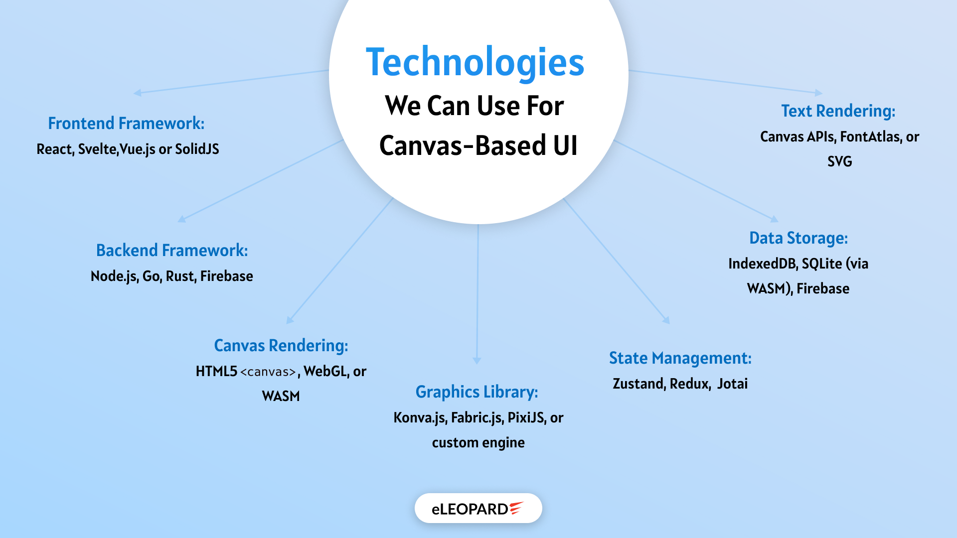
When building a canvas-based UI, the foundation you lay with your tech stack will directly impact performance, scalability, and developer experience. The choice of technologies is not just about rendering shapes—it’s about enabling real-time interactions, intuitive navigation, and seamless integration with state and UI logic.
A Figma-like interface demands a harmonious blend of rendering efficiency, state synchronization, and UI responsiveness. Here’s how to pick the right tools for each layer of your application:
1. Framework: React for Dynamic Interfaces
React remains one of the top choices for building interactive UIs, thanks to:
- Its component-based architecture simplifies reusable elements like toolbars, property panels, and shape editors.
- Powerful state and context systems for managing complex UI states and interactions.
- A vast ecosystem of third-party libraries, including React Konva, which integrates canvas rendering with React’s lifecycle.
If you prefer alternatives, Vue.js and Svelte also offer reactive data binding and may work well in smaller or more performance-sensitive projects.
2. Canvas Rendering: Konva.js and React Konva
For canvas rendering, Konva.js offers a well-rounded abstraction over the native HTML5 canvas element. It provides:
- Support for layers, groups, and transformations.
- Events like onDragMove, onMouseEnter, and onTransform, are critical for interactive design tools.
- Performance optimizations are built in, allowing smooth rendering even with multiple complex objects.
Paired with React Konva, you can build declarative canvas components using familiar JSX syntax, making your codebase more readable and maintainable.
3. State Management: Redux or Zustand
Canvas UIs often handle complex and deeply nested states, such as layers, selections, zoom levels, undo/redo history, and collaborative changes. A robust state manager is key.
- Redux: Great for large-scale apps where predictability and debugging are critical. Tools like Redux DevTools can help visualize every state mutation.
- Zustand or Jotai: Lighter alternatives that offer reactivity without the boilerplate.
Centralizing the state also helps coordinate interactions across the canvas, UI, and collaboration engine.
4. Real-Time Sync: WebSockets, Yjs, or Liveblocks
If you’re planning to support multi-user collaboration, your tech choices must support real-time communication and eventual consistency.
- WebSockets: Low-latency protocol for pushing updates between clients.
- Yjs / Automerge: CRDT-based libraries that resolve conflicts automatically in shared editing environments.
- Liveblocks: Plug-and-play real-time infrastructure designed for collaborative tools.
These enable features like live cursors, simultaneous editing, and version-safe operations, just like in Figma.
5. Performance Enhancers and Utilities
- Throttling/Debouncing: Prevent performance issues during rapid input events (e.g., drag, zoom).
- requestAnimationFrame: Schedule smooth canvas redraws during animations or transformations.
- Virtualization Techniques: Only render what’s in the viewport to save memory and processing power.
- Event Listeners & Keyboard Shortcuts: Ensure intuitive UX and accessibility.
Choosing your tech stack wisely gives you the power to scale, extend, and optimize your canvas UI as user expectations grow.

Architectural Overview
Designing a powerful and scalable canvas-based UI goes far beyond drawing shapes on the screen. It requires a well-structured architecture that balances performance, maintainability, and flexibility, especially as the complexity of interactions and real-time collaboration grows.
At a high level, your architecture should separate concerns across layers—handling rendering, interaction, state management, and user interface logic independently. This modular approach not only improves performance but also makes your application easier to scale, debug, and extend over time.
Let’s break down the core architectural components of a Figma-like canvas UI:
1. Canvas Rendering Layer
This layer is responsible for drawing everything on the screen. Whether you’re using HTML5 Canvas, SVG, or a rendering library like Konva.js, this layer handles:
- Rendering shapes, images, and connectors.
- Applying transformations (scaling, rotating, resizing).
- Managing layers for better control (e.g., background grid vs. active objects).
- Optimizing redraws for smooth performance.
Separating this from the UI layer allows for high-frequency updates without re-rendering unrelated UI components.
2. Interaction Layer
This component manages user input and translates it into meaningful canvas actions. Key responsibilities include:
- Handling mouse and touch events (click, drag, wheel, tap).
- Enabling zoom and pan with natural gestures.
- Detecting selection areas and object boundaries.
- Routing interactions to the correct canvas element.
This layer often utilizes tools such as React Konva, Pointer Events API, or custom event emitters to provide precise interaction control.
3. Application State Layer
State is the single source of truth for:
- Canvas object data (position, size, properties).
- Viewport settings (zoom level, scroll position).
- UI state (selected tool, active object).
- Collaboration and user presence data.
A centralized state manager like Redux, Zustand, or Jotai ensures that all layers stay in sync and that complex interactions—such as undo/redo or real-time syncing—are easier to implement.
Bonus: When the state is decoupled from rendering, features like “export to JSON” or “version history” become far easier to build.
4. Command & History Layer
This layer acts as the action dispatcher for your app. Rather than applying changes directly to the state, you dispatch commands that:
- Modify canvas objects.
- Record actions for undo/redo.
- Support keyboard shortcuts like Ctrl+Z, Ctrl+C, etc.
By abstracting actions into commands, you keep business logic centralized and testable.
5. UI & Tooling Layer
The UI layer includes all non-canvas elements:
- Toolbars, property panels, color pickers, and shape menus.
- Context menus for right-click actions.
- Dialogs for saving, sharing, or exporting.
- Zoom sliders or mini-map components.
This part is primarily built with your chosen frontend framework (e.g., React), and connects to the state layer to stay in sync with canvas events.
6. Collaboration & Sync Layer (Optional)
For real-time features, this layer handles:
- User sessions and live cursor presence.
- Operational transforms or CRDTs for syncing changes.
- Conflict resolution and consistent data flow.
- Server communication via WebSocket, WebRTC, or hosted services like Liveblocks.
You can make this an optional enhancement, but building it with separation in mind ensures that single-user and multi-user versions share most of the same codebase.
Why This Architecture Works
- Modular: Each layer can evolve independently without breaking others.
- Scalable: Supports future needs like plugins, templates, or version control.
- Performant: Canvas and UI updates are handled separately, keeping frame rates high.
- Testable: Commands and state changes can be tested in isolation.
- Maintainable: New features like object snapping, grids, or real-time collaboration can be added with minimal friction.
A strong architectural foundation is the key to building not just a functional canvas tool but a robust, user-friendly, and production-grade platform that can scale alongside user demands.
Implementing the Core Features For Building Canvas-Based UI
1. Canvas Initialization and Rendering
2. Zooming and Panning Experience
3. Object Creation and Transformation
4. Selection and Interaction
5. Layering and Grouping Objects
6. Precision Tools and Snapping
7. Undo, Redo, and History Tracking
8. Clipboard Actions and Duplication
9. Real-Time Collaboration (Optional but Impactful)
For more advanced use cases, real-time collaboration can be integrated to allow multiple users to edit the same canvas simultaneously. This requires syncing canvas state across clients through technologies like WebSockets or CRDT libraries such as Yjs or Automerge. Collaboration features may include live cursors to indicate where each user is interacting, edit locking to prevent conflicts and real-time updates to the canvas and UI. Though complex, implementing collaboration can dramatically enhance the tool’s value, particularly for design teams and remote workflows.
Each of these features contributes to the overall usability, performance, and polish of a canvas-based UI. Implementing them in a layered, modular fashion ensures that the application remains scalable and maintainable as it grows. By replicating the thoughtful, responsive behaviors found in tools like Figma, you can create a user experience that feels professional, empowering, and delightful to use.
Some Issues/Challenges in Creating Canvas UIs
1. Zooming & Panning
The Problem:
- Zoom didn’t center around the cursor.
- Scrolling caused inconsistent behavior.
- User feedback indicated disorientation during navigation.
The Challenge:
Create a smooth zooming/panning system that mimics modern tools like Figma:
- Cursor-centered zoom.
- Scroll to pan without jarring transitions.
- Seamless integration with canvas state and object layers.
How eLEOPARD Suggests Approaching the Solution
Implementing Cursor-Centered Zoom
- Captured wheel events and checked for Ctrl/Meta modifiers.
- Calculated new scale, and adjusted the x and y canvas offsets based on the pointer’s relative position.
- Used precise math to ensure zooming happens around the current mouse location, not the canvas center.
Managing State and Levels
- Centralized canvas state in Redux, making it easier to manage zoom levels, position, and interaction states.
- Used a ZOOM_LEVELS array to define discrete zoom steps (e.g., 10%, 25%, 50%, 100%, 200%, etc.).
- Prevented over-zooming or zooming too far out with boundaries.
Smooth Panning
- For default scrolling (no Ctrl key), natural panning by adjusting canvas x and y positions using scroll delta.
- Ensured panning had constraints to avoid users “losing” their content offscreen.
Final Result
- Zooming and panning felt intuitive and matched the expectations of users familiar with tools like Figma.
- Performance stayed smooth even with large-scale zooming due to throttling and efficient redraw logic.
Conclusion
Building a canvas-based UI like Figma is a challenging yet rewarding journey. From the initial rendering engine to implementing seamless zooming and panning, every component requires thoughtful planning and execution.
If you’re building a next-gen design tool, diagram editor, or collaborative whiteboard, investing in a performant, intuitive canvas is a must. While the road may seem complex, with the right architecture and mindset, you can create a professional-grade experience rivaling tools like Figma.
Looking to Build a Canvas-Based UI Like Figma? Let eLEOPARD Help
Creating a canvas-based UI with the power, flexibility, and polish of Figma requires not only technical expertise but also a deep understanding of user experience, performance optimization, and real-time collaboration. Whether you’re building a full-fledged design tool, a collaborative whiteboard, or a custom visualization platform, you need a team that has done it before—and done it well.
At eLEOPARD, we specialize in creating high-performance web applications with advanced canvas rendering and modern front-end architectures. Our team has hands-on experience building scalable design tools with features like zooming, panning, object manipulation, multi-user collaboration, and pixel-perfect precision—all backed by clean, maintainable code.
If you’re looking to bring your product idea to life or scale your current application with powerful canvas capabilities, we’re ready to partner with you. From MVP to full product development, we’ll help you plan, architect, and build a tool that stands out.
Ready to get started? Contact eLEOPARD today and let’s build something extraordinary together.