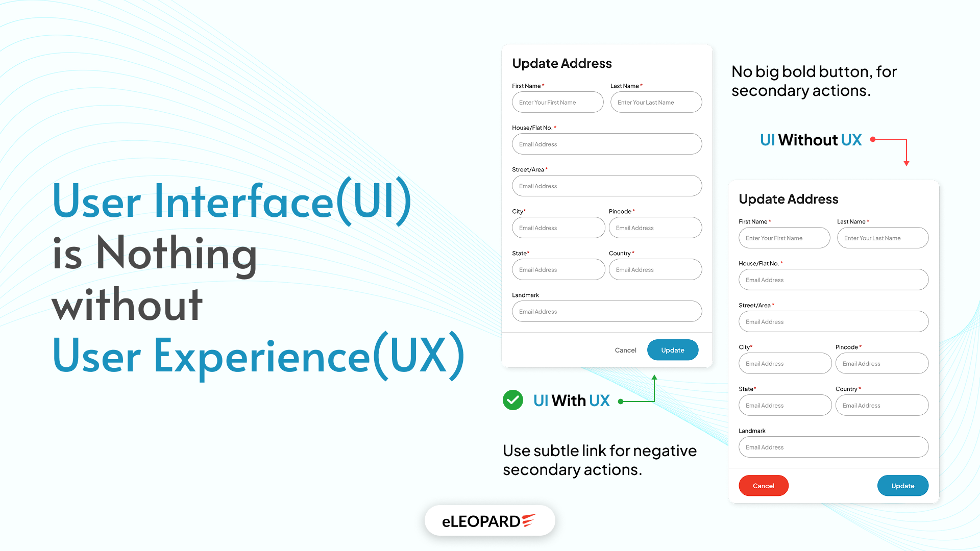
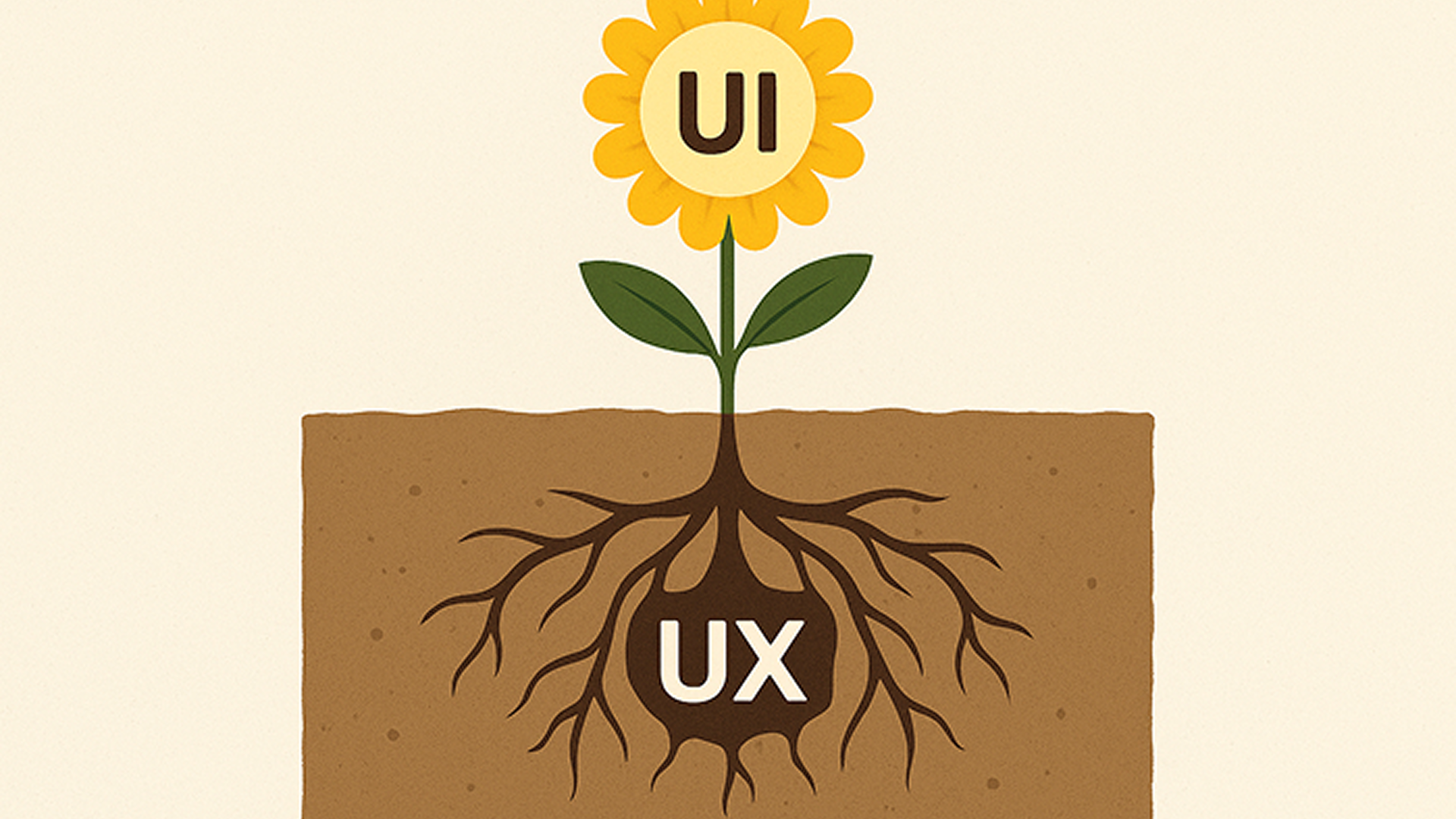
As an HTML/CSS designer by heart at eLEOPARD, I once believed that User Interface (UI) and User Experience (UX) were the same thing. While they are deeply connected, equating the two is like admiring a beautifully designed book cover, only to find the pages inside are blank. One simply cannot truly shine without the other. From my perspective, an eye-catching interface (UI) means nothing if the experience (UX) behind it doesn’t support the user’s journey.
What You See vs. How You Feel
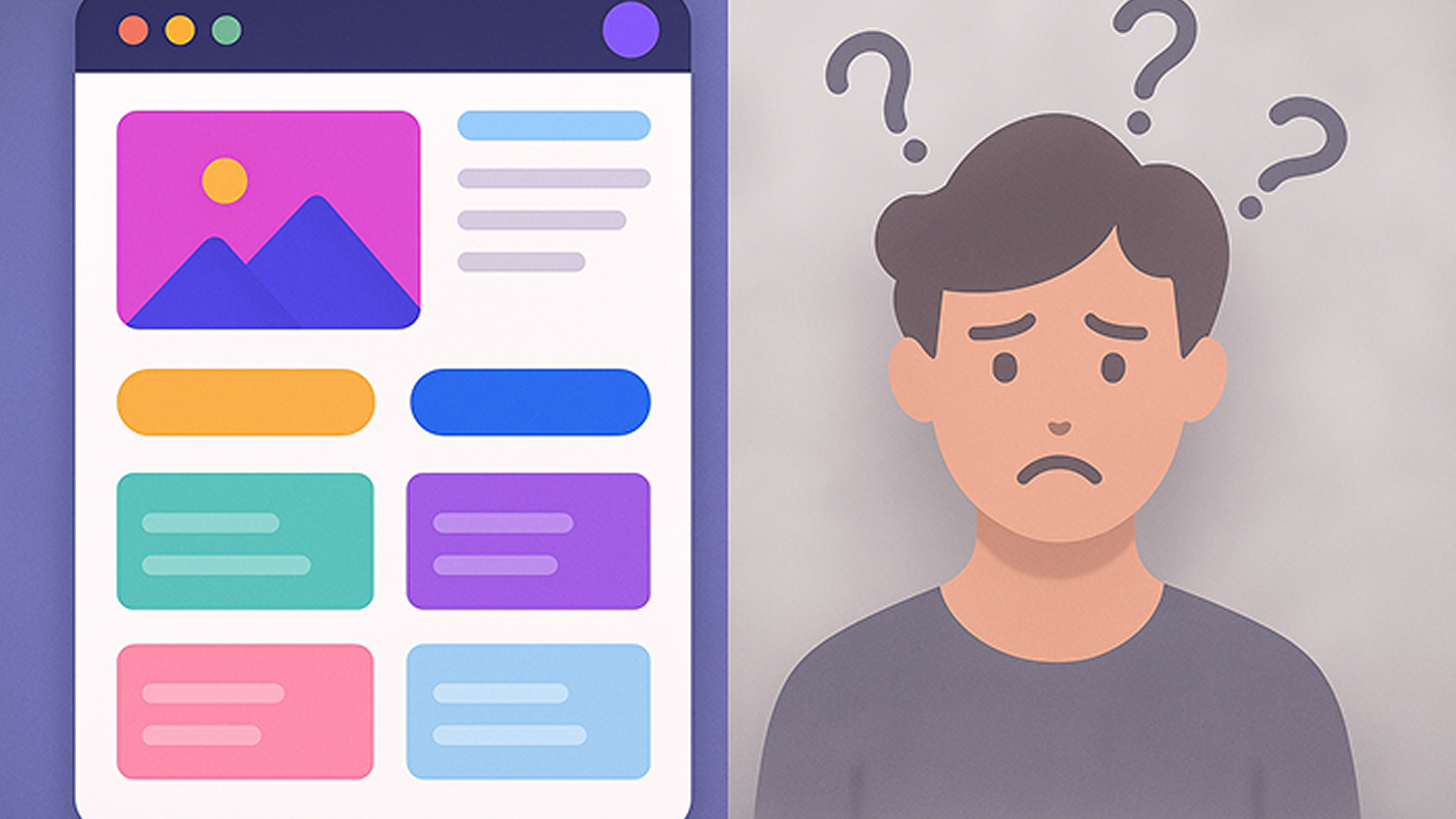
Let’s imagine you’re looking for an informative website or app to gather information. For instance, you’re searching for a restaurant that offers a variety of delicious cuisine options, has a great ambiance, and is family-friendly. Now, imagine you visit a site that allows you to filter restaurants based on all these specific requirements. Wouldn’t that be superb?
When you first land on such a website, what do you notice?
- How does it look? Are the site’s colors, images, navigation links, and buttons visually appealing?
- Does it give you the vibe that you’ve landed in the right place? Can you instantly tell that you’ll find what you’re looking for?
- Is the information easily accessible? Can you quickly identify where to go or how to get the information you desire?
These points are all part of the User Interface (UI) – the visual and interactive elements.
Beyond the Surface: The User's Journey
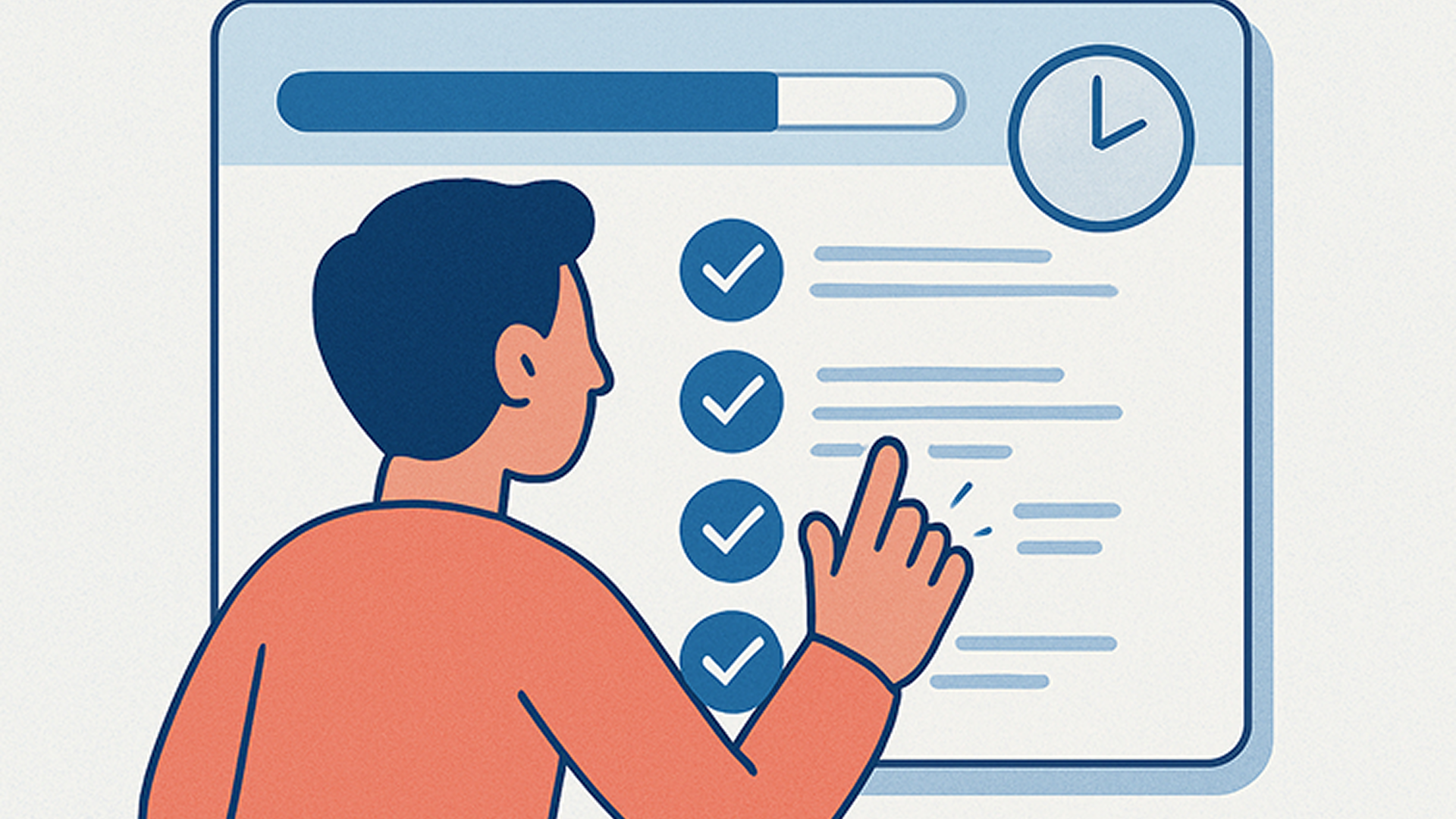
Now, let’s move beyond the visuals to the actual functionality of this website. You’ve reached a list of restaurants.
- How fast did the site load? Did you feel like it was stuck, or did it retrieve dynamic content quickly? (No kidding, in such a site’s “kitchen,” a lot is going on!)
- Are there enough filter options for long lists? Can you precisely narrow down your search for the exact restaurant you’re looking for? Sometimes, even filter options need their own filters to exclude what we don’t want!
- Is the information updated? Does the site manager regularly refresh the details, or does it provide an option for visitors to share their own experiences, which helps others?
These crucial aspects are part of the User Experience (UX) – how the site actually works and feels as you use it.
Why Both Matter
If UI and UX embrace each other in a website or app, the UI will consistently attract new visitors. But it’s the UX that truly helps to retain a greater number of visitors, fostering growth and ensuring expectations are met with every visit.
“A good-looking and well-designed UI is like an impeccably crafted instrument. But the smooth, satisfying, and effective UX is the beautiful music that the instrument creates.”
Enhancing the Experience
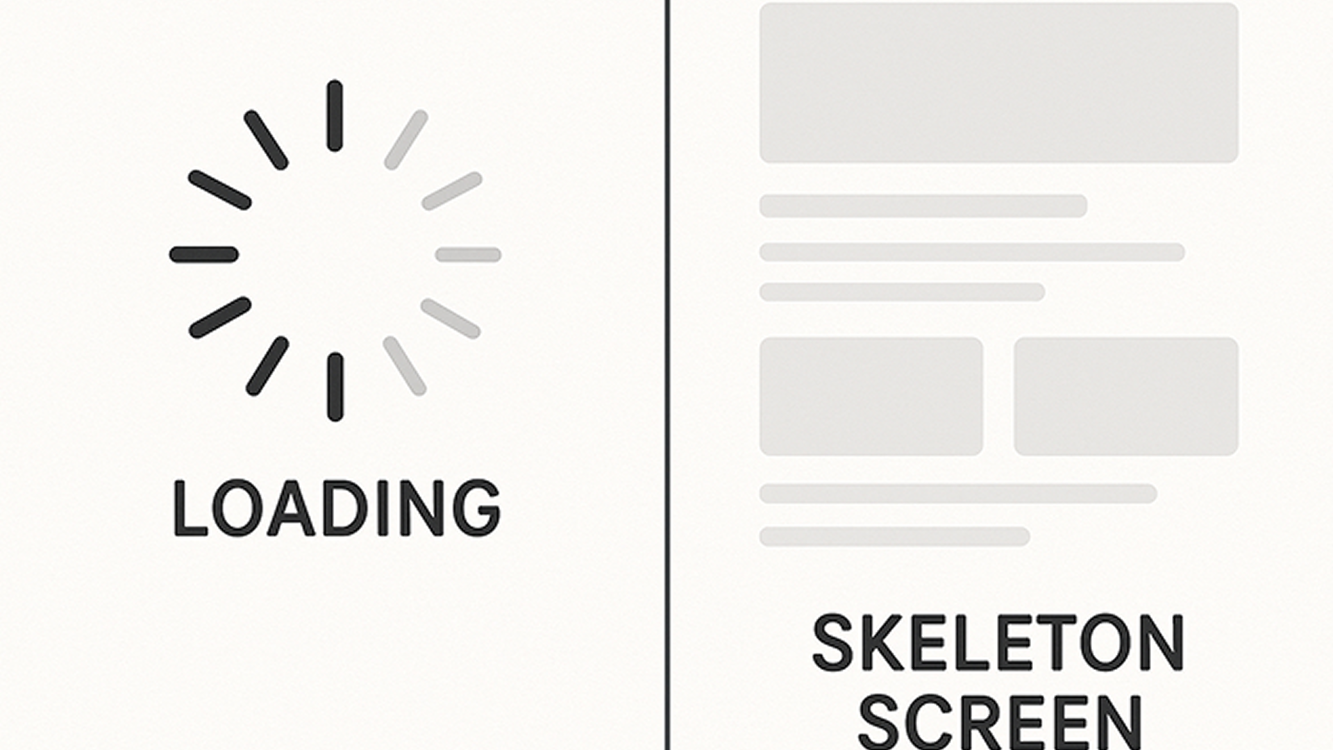
Consider this: on large informative sites, many designers are now using customized skeleton loading instead of a boring spinner or loader with an overlay.
Skeleton Loading: Also known as skeleton screens or placeholder loading, this UI design pattern provides a visual indication that content is loading by mimicking the structure of the final content. It makes waiting feel less tedious and more engaging.
A Real-World Lesson
During a team outing, we stayed at a hotel with a very fancy elevator: shiny panels and glowing lights. However, some of us got stuck trying to figure out how to select our floor because there were no clear instructions. The floor numbers were there, but they wouldn’t work until you inserted your key card into an “invisible card holder.”
In this scenario, the UI was the beautiful panel and lights. The UX was a frustrating and confusing journey of trying to reach our floor.
My Key Takeaways at eLEOPARD
Through experiences like these, I’ve come to understand that:
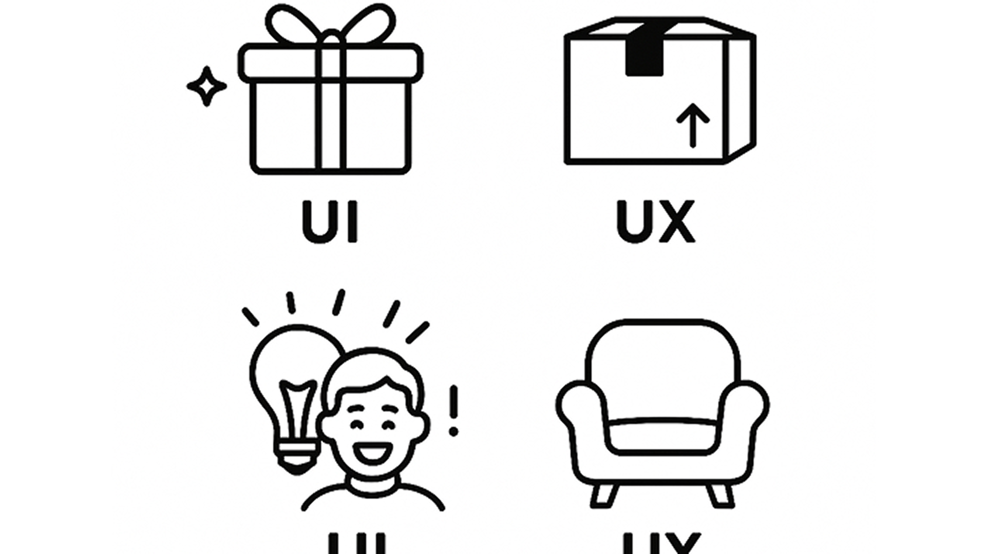
- UI is the promise; UX is the delivery.
- UI makes people go “wow”; UX makes people go “aha!”
- UI invites users in; UX keeps them there.
Bringing UI & UX Together
At eLEOPARD, our approach has evolved based on these insights. We now:
- Start every project with user stories, not color palettes.
- Map out user journeys before we touch a single pixel.
- Test low-fidelity wireframes before animating buttons.
- Prioritize clarity over cleverness.
A Few Takeaways for Fellow Creators
If you’re designing anything—be it a website, app, plugin, or dashboard—always remember:
- Ask yourself what the user is trying to accomplish.
- Avoid “form over function.” A beautiful design means nothing if it confuses users.
- Use spacing, colors, and animations to guide, not distract.
- Get feedback from real users (not just your team).
- Don’t be afraid to iterate – your first draft is rarely your final answer.
One Last Thought from Team eLEOPARD
I’ll leave you with a quote from Skand and Shobhit, our mentors at eLEOPARD, who shared during a general discussion:
“User Interface (UI) serves as the initial showcase, but User Experience (UX) must always be the foundational focus of our products. We do have the flexibility to refine and evolve the UI as needed to continuously strengthen and empower the overall UX.”
At eLEOPARD, we’re still learning with every project, every user test, and yes, every mistake. But we’re proud of how far we’ve come. We no longer chase beauty alone; we aim for experiences that work, feel right, and make users come back.
Over to You…
Do you focus more on UI or UX in your work? What valuable lessons have you learned from your past projects?
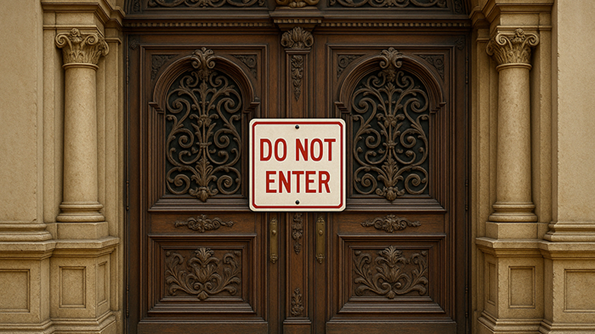
As creators, let’s aim for more than just beauty. Let’s strive for clarity, simplicity, and empathy. Because at the end of the day, UI without UX is like a door that’s too heavy to open – it may be gorgeous, but it just doesn’t work.