The world of User Interface (UI) and User Experience (UX) is constantly evolving, pushing the boundaries of how we interact with technology. Staying ahead of these trends is crucial for designers and developers alike. Let’s dive into some of the most exciting and impactful new directions in UI/UX.
Here are eight new trends in UI/UX design, explained with clear and easy-to-understand points, each accompanied by an example image.
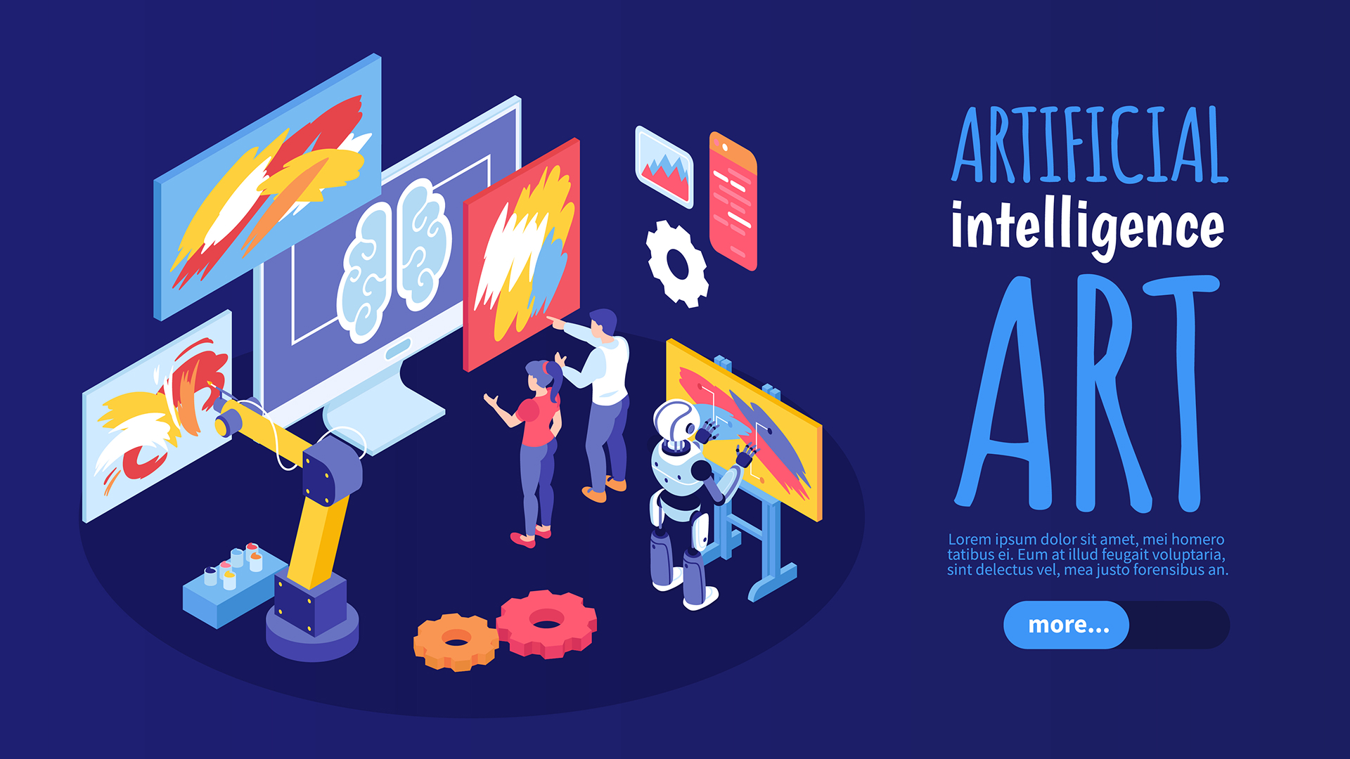
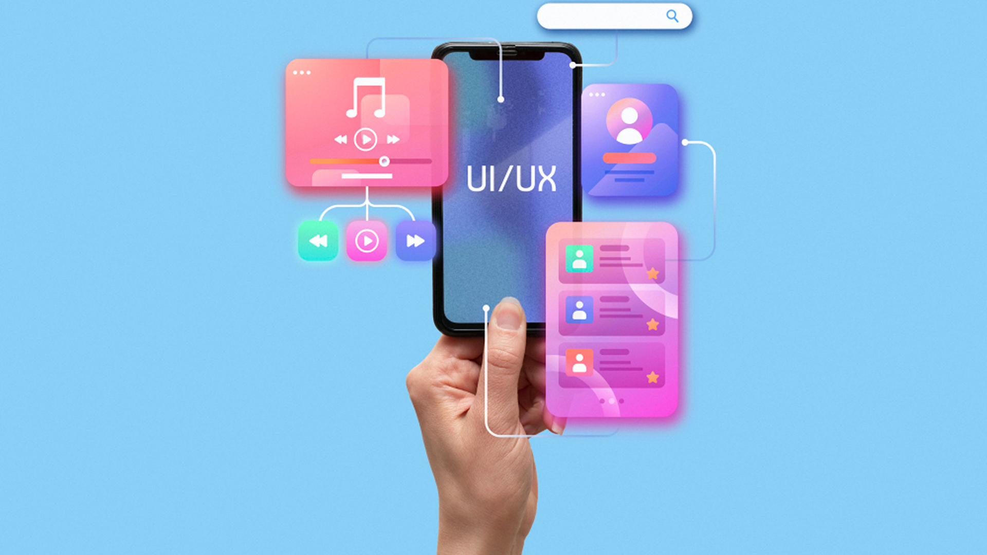
AI-Integrated Design
AI is moving from a back-end tool to a front-end feature, creating personalized and dynamic user experiences. It helps with things like content recommendations, smart search, and even generating design elements on the fly.
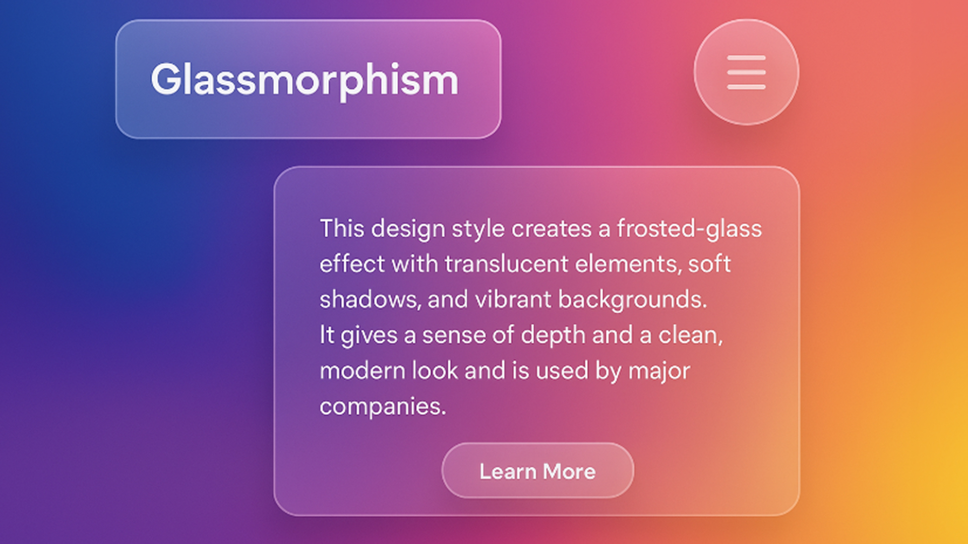
Glassmorphism
This design style creates a frosted-glass effect with translucent elements, soft shadows, and vibrant backgrounds. It gives a sense of depth and a clean, modern look and is used by major companies.
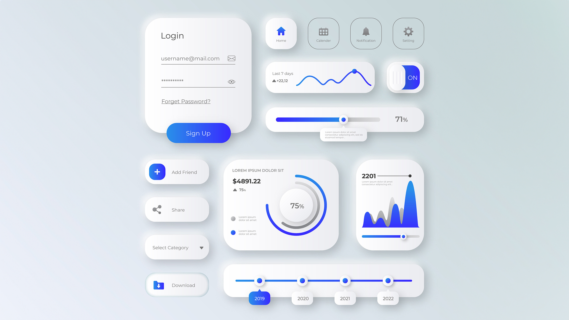
Neumorphism
A style that combines elements of flat design and skeuomorphism to create a soft, extruded plastic look. It uses shadows and highlights to make UI elements appear as if they are part of the background surface.
Emotionally Intelligent Design
Designers are focusing on creating interfaces that build trust and emotional resonance through expressive typography and contextual animations, mimicking human-like interactions.
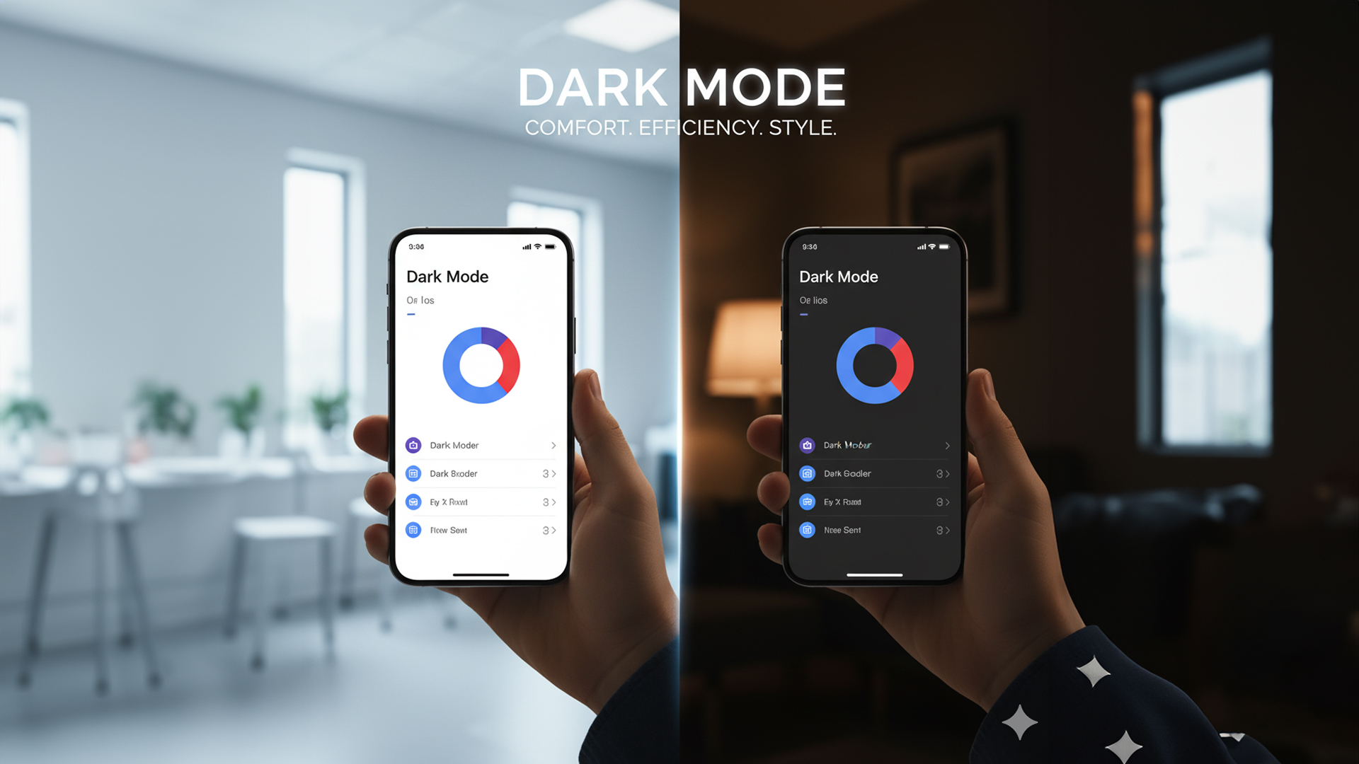
Dark Mode
More than just a stylistic choice, dark mode is a dominant trend that reduces eye strain, saves battery life on OLED screens, and provides a sleek, modern aesthetic. Many apps and websites now offer it as a standard option.
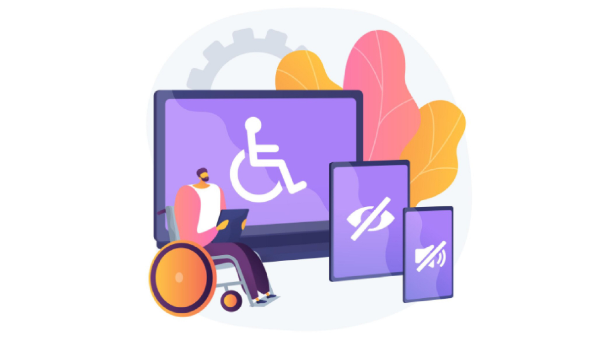
Accessibility-First Design
Ensuring that interfaces are usable by everyone, regardless of ability, is paramount. This includes considerations for screen readers, keyboard navigation, color contrast, and more.
Vibrant Gradients & Color Transitions
Smooth, vibrant gradients are making interfaces more visually striking and helping brands differentiate themselves. These aren’t the harsh gradients of the past—modern gradients are subtle, sophisticated, and purposeful, adding depth without overwhelming content.
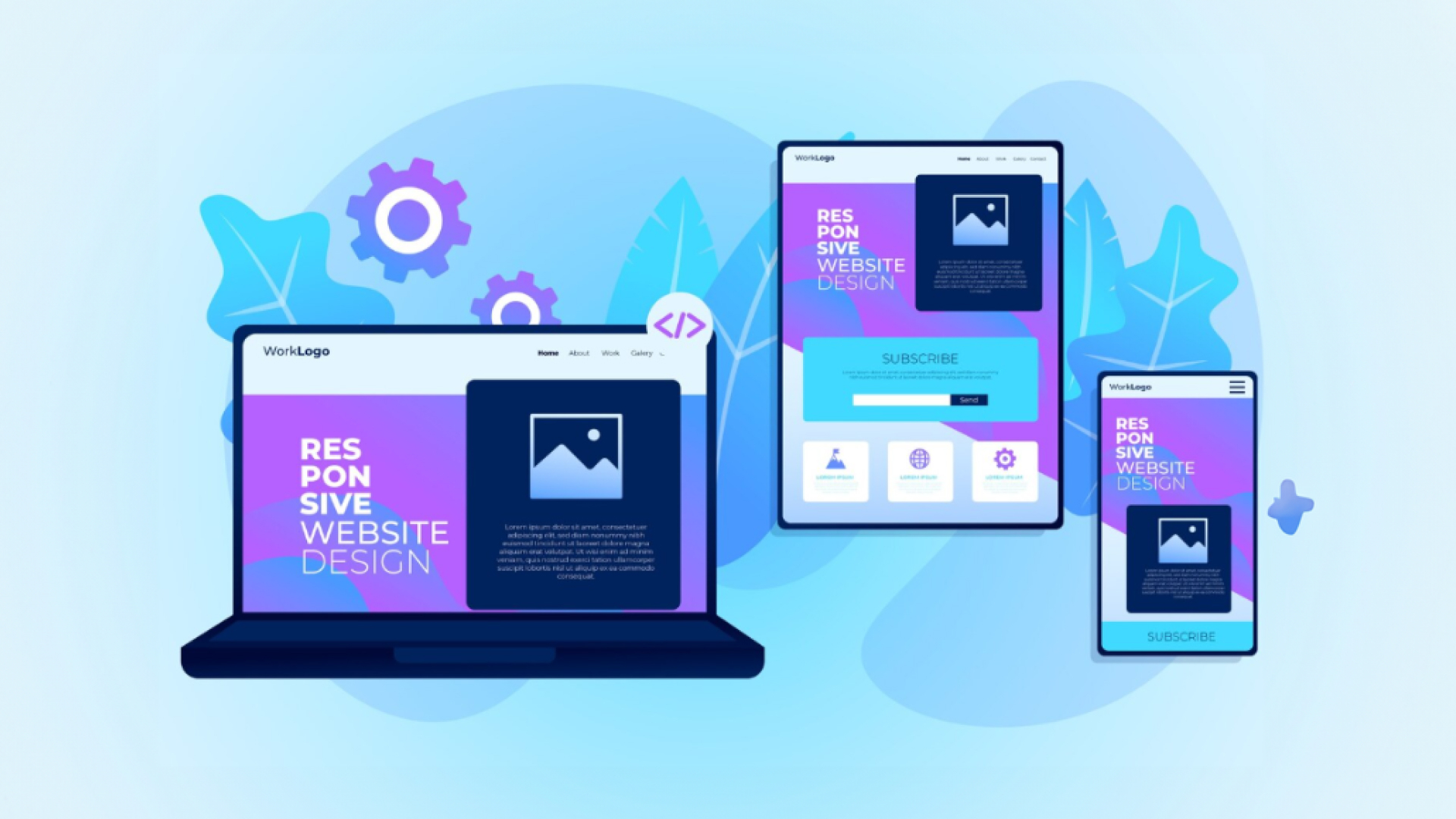
Mobile-First Responsive Design
With mobile traffic now exceeding desktop usage, designers are adopting a mobile-first approach. This means starting with mobile constraints and scaling up, ensuring optimal experiences on smaller screens while creating seamless transitions across all devices.
Advanced Microinteractions
Small, subtle animations and feedback (like a button changing color on hover or a “like” animation) significantly enhance user engagement and provide immediate feedback, making the interface feel alive.
This popular trend continues, offering benefits like reduced eye strain and improved readability, especially when paired with high-contrast colors.

